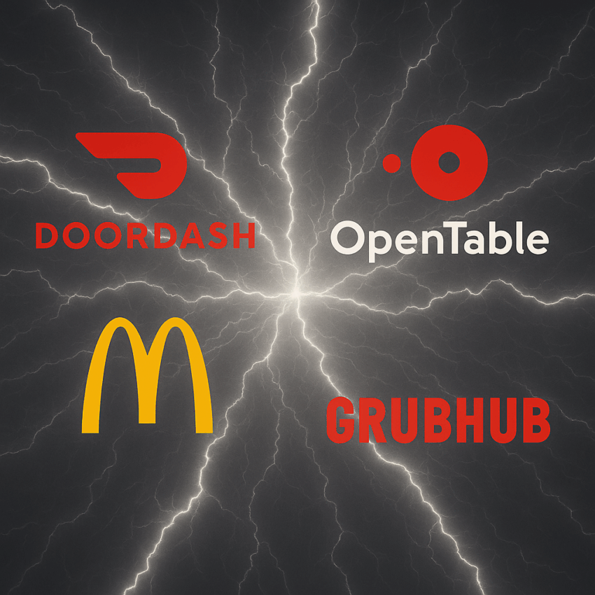
Ever opened your phone when you’re hungry and noticed something strange? Almost every food delivery app, DoorDash, OpenTable, Zomato, McDonald’s, glows in red or orange. (Uber Eats is an exception!). Meanwhile, your PayPal & Amex app is a calming shade of blue, your fitness app leans green, and your social media icons sit somewhere in between. Coincidence? Not at all.
Colors are not decoration. They’re psychological nudges carefully chosen to trigger the right emotion at the right time.
Colors don’t just decorate apps, they shape how we feel and act. Red and orange trigger excitement and appetite, which is why they dominate food delivery icons. On a crowded home screen filled with hundreds of apps, these shades act as instant shortcuts for the brain, nudging us toward the behavior each app wants.
Here’s the deeper layer: Behind these color choices lies classic consumer behavior theory. Through conditioning, we’ve learned to link red with hunger, blue with trust, and green with nature. And when information is limited (like a tiny app icon) we rely on visual cues such as color to guide our choice. Food apps live in the world of cravings and impulse decisions. You’re not planning for next year; you’re planning for the next 20 minutes.
That’s why red dominates. It’s one of the most visible colors, proven to stimulate appetite and create a sense of urgency. Pair it with images of fries, pizzas, or sushi, and you’ve got an irresistible call to action.
Think about it: you don’t scroll, analyze, or compare much when you’re hungry. You just tap.
Now flip the context. Imagine moving thousands of dollars, tracking your health, or sharing personal data. Would you want that app screaming in red? Not really. This is where blue and green shine: Blue signals trust and stability. That’s why PayPal, LinkedIn, and your banking apps rely on it. Blue slows you down and makes you feel safe. Green signals health, balance, and sustainability. It’s no accident that Calm, Fitbit, and Whole Foods lean on it. These apps want you to feel grounded and consistent, not impulsive. In consumer behavior terms, these colors are about risk reduction. They reassure you that your choices are thoughtful and secure.
